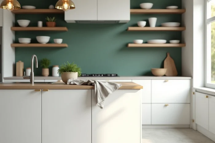
When installing a modern white kitchen, the first instinct is to choose the facades, the countertop, and the backsplash. The walls often come last. This is a sequencing error: the color of the walls influences the perception of everything else, including the room’s temperature and the sense of volume.
Warm white or cool white facades: the starting point for choosing wall color
Decor articles refer to “white kitchen” as a homogeneous block. In practice, two white kitchens can produce opposite effects depending on their undertone. A white leaning towards blue or gray (cool white, often found on glossy lacquered facades) reacts very differently than a cream or ivory white (warm white, common on matte or laminate facades).
Before selecting a wall shade, hold a paint sample against the cabinet facade in natural light. A beige that is too yellow clashes with a very cool white, and a bluish gray accentuates the coldness of an already icy white. This assessment takes two minutes and avoids a disappointing result.
If your cabinets lean towards ivory or magnolia, the walls can support earthy shades: sand, soft ochre, muted terracotta. If the facades are pure white or optical white, you should lean towards warm grays, sage greens, or muted blues that create contrast without temperature conflict.
To delve deeper into what wall color with a white kitchen, this intersection of facade undertones and wall shade remains the most reliable criterion.
Top-bottom strategy: painting kitchen walls while playing with volumes
We often think in flat terms: a single color on all four walls. However, modern white kitchens benefit from a more precise division, inspired by what decorators call the volume strategy.
Dark lower part, light upper part
The principle is simple: paint the lower part of the wall in a strong shade and the upper part in a light tone. The separation line is set at the height of the countertop or slightly above, between 90 and 110 cm. The result visually anchors the kitchen to the floor and gives the impression of a higher ceiling.
In a white kitchen, an olive green or duck blue on the lower part, paired with a broken white above, works particularly well. Avoid overly saturated colors on a large surface, as the room’s light (especially if it faces north) can dull them.
The accent wall behind the sink or island
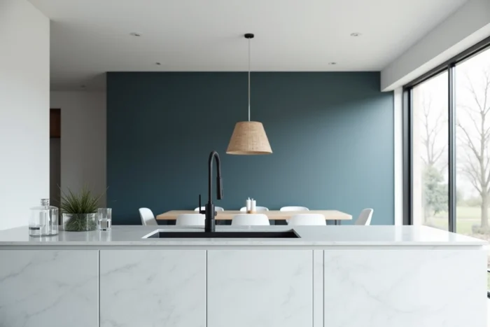
The alternative to the lower part is to concentrate color on a single wall, usually the one you spend the most time facing. In an L-shaped or U-shaped kitchen, this is often the wall behind the sink. With a central island, prioritize the wall opposite the seating area.
A single colored wall is enough to transform the ambiance without weighing down the space. The rest of the walls can remain in a warm white or a very light neutral tone.
Concrete wall shades for modern white kitchens: what works in practice
Rather than an exhaustive catalog, here are the combinations we see repeatedly in actual kitchens, along with their limitations.
- Sage green: the most versatile shade with contemporary white. It works well with both wood and gray quartz countertops. Feedback varies on this point depending on artificial lighting, as some cool LEDs shift sage towards khaki.
- Warm gray (greige): a middle ground suitable for kitchens open to the living area. It does not create too sharp a break between the two spaces. The pitfall: choosing a gray that is too light, which ends up looking like dirty white under direct natural light.
- Muted blue (like Prussian blue or petroleum blue): reserved for well-lit kitchens. In a dark room, it absorbs light and visually reduces space. Applied to a single accent wall, it adds depth without overwhelming.
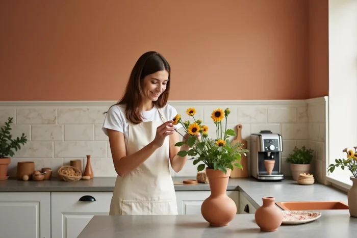
- Soft terracotta: suitable for white kitchens with warm undertones featuring natural wood in countertops or shelves. It adds warmth without veering into rustic if chosen in a desaturated version.
Paint finish in the kitchen: a technical detail that changes the outcome
There is a lot of talk about color, but less about finish. In the kitchen, the practical constraint is significant: water splashes, cooking vapors, fingerprints. Satin finish remains the standard for kitchen walls because it cleans easily without reflecting light too aggressively.
Absolute matte, very trendy in living areas, poses a concrete problem in kitchens: stains become ingrained and cleaning leaves halos. Some brands offer “washable” mats, but their actual resistance depends on the formulation. It is recommended to test on a small section of wall before committing to the entire room.
Glossy finish, on the other hand, amplifies every defect of the wall (irregularities, joints, roller marks). It only makes sense on a perfectly prepared surface, which increases the time and cost of implementation.
Off-white on the walls: an underrated option for white kitchens
The most common reflex is to look for a “real” color to contrast with the white of the cabinets. It is forgotten that the current trend favors warm whites on the walls rather than pure clinical white. A wall in ivory, bright sand, or magnolia creates a soft envelope around a white kitchen without a flat monochrome effect.
The shade works if it differs sufficiently from the white of the facades. We seek a visible but not harsh difference: two to three shades apart on a color chart is sufficient. Adding texture (troweled plaster, mineral effect paint) reinforces the distinction between walls and cabinets without resorting to a bold color.
Choosing the wall color for a white kitchen is not just a matter of personal taste. The undertone of the facades, the orientation of the room, the paint finish, and the distribution of color in the space determine the result as much as the shade itself. It is better to place two samples on the wall for three days than to rely on a screen rendering.